Q&A: Telling A New Color Story with Sherwin-Williams


Colorful design goes beyond one product—it requires cohesion across all elements in a space, especially when tapping into new design trends, or perfecting school and corporate colors in collaboration zones.
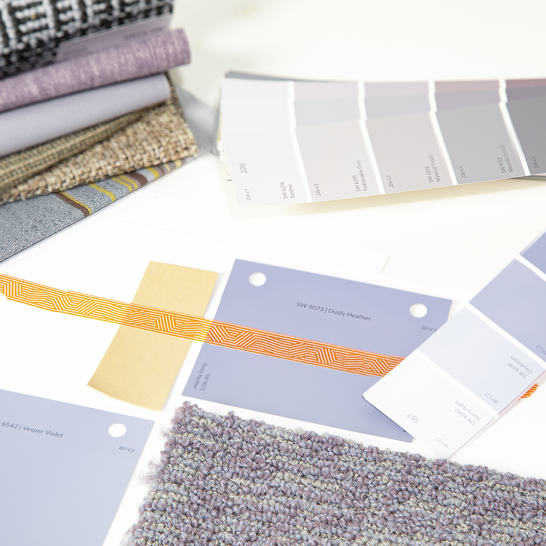
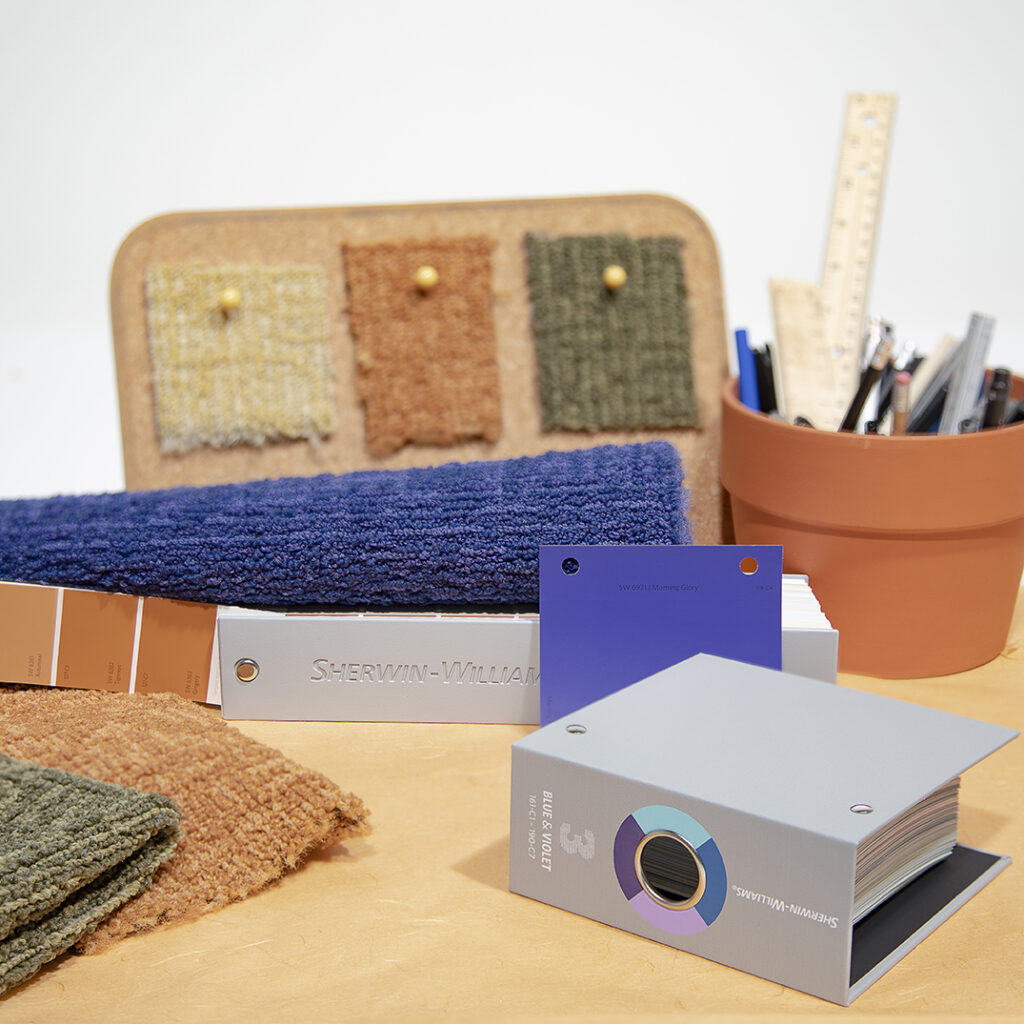
That’s why we’ve partnered with Sherwin-Williams to bring your color vision to life through our newest launch, Free Pass. This new partnership was created to make the design process more seamless through a standardized color system that allows you to choose and communicate color choices more easily. A designer can choose color inspiration from Sherwin-Williams’ extensive color library through its ColorSnap fan decks, that will be matched exactly in the carpet through our COLORCAST system. Once you choose your carpet, the rest of your color choices are made that much simpler with the ColorSnap system.
To dive into the color trends currently shaping the architecture and design industry, we met with Emily Kantz, Color Marketing Manager at Sherwin-Williams, to discuss our partnership, the design process and how color is evolving across segments.
Bentley Mills: How does this new collaboration with Bentley make the decision process more seamless for designers?
Emily Kantz: When designers are specifying products to bring the vision in their head to life, finding the perfect color isn’t always achievable. There are limitations in product offerings and color choices—which is why it’s great that we’re partnering with Bentley to supply fan decks to designers, allowing them access to color inspiration right at their fingertips.
Paint color is what ties everything together in the end, so taking that and applying it to the carpet is a unique opportunity—with the fan decks you can see what needs tweaking for a spot-on color and designers count on this. They know Bentley has a great reputation, so adding color accuracy to the partnership alleviates the headache and makes the lives of designers easier.
BM: What colors are designers leaning towards and how are current trends impacting design choices?
EK: Tried-and-true neutrals and greys continue to be popular, but pastels are taking an interesting twist and turn. Sustainability continues to play a large role in design, inspiring a greyish undertone in pastels—recycled materials and content make them muted without pure white undertones.
On the other hand, the preppy look is also shifting back into designs with bright greens, pinks and yellow taking on a greater presence. Older design styles are resurfacing and inspiring jewel tones and fresh twists on older buildings. We’re also seeing designers move away from sterile white environments, instead opting for a dose of personality. Specifically, we’re seeing a post-COVID shift happening with employers offering fun and noisy areas decked in color, areas that evoke happiness and positive emotions, and colors that dictate spaces or present a sense of company culture.
BM: What design trends are you seeing where color can play a bigger factor?
EK: When looking at color trends and design overall, we’re seeing a focus on inclusivity—spaces that make people feel comfortable. Many designers are taking neurodiversity into consideration—thinking about those who are agitated by loud noises or bold color, and creating spaces so people can choose what type of environment they want to work in at different times of day for different types of work. Color plays a huge role in this, as collaborative spaces lean into brighter colors to bring energy while more neutral and muted tones designate quiet spaces for individual productivity.
Looking at specific segments, a lot of this thinking applies to education. For children, colors can act as a natural cue, designating what environments mean and the purpose of a space. We also see color directing spaces in healthcare, with private zones and public zones being designated by specific colors. Across industries, color is always playing a role in purposeful infusions in space—and designers are listening to the growing demand for visuals cues.

BM: How are you seeing color saturation play out in design?
EK: Showstopping color drenched looks are growing in popularity—and now we have a way to support this design vision. Designers create an idea in their mind and need a color to match that. With our ColorSnap fan deck they’ll be able to achieve this vision with a paint shade that’s custom made into carpeting with the development of Free Pass and Bentley’s COLORCAST technology. Even if it’s an area separated by architectural draping, sheer color, we can help designers create a fun, designated “zone.” Creating zones with color is becoming more common, as commercial interiors require collaborative or fun spaces, such as designated huddle rooms separate from individual workstations. The newfound flexibility in products allows more freedom for color throughout space—without needing to switch the product, but rather just switch the shade or color entirely.
BM: What’s your personal favorite Sherwin-Williams color right now?
EK: One I’ve been really interested in lately is Carnelian! It’s a dark, rich plum wine color. It’s very dark and moody and looks beautiful on the wall.
Explore Sherwin-Williams hottest color trends at swcolorforecast.com and discover the full potential of these trending hues with our complete portfolio of products. Architects, Specifiers & Designers Resources | Sherwin-Williams
