Seeing Things
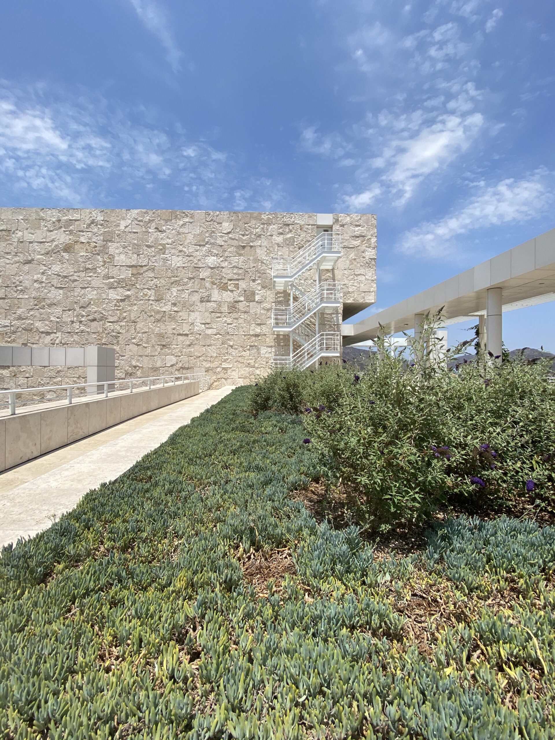
I’m able to see art again. After over a year of closed galleries and museums, and as a new resident of LA, I have a lot to see. In June, I went to LACMA (Los Angeles County Museum of Art) with my sister. As soon as we arrived in the first gallery, we looked at each other with tears in our eyes, moved by awareness that we would be spending the next several hours surrounded by art.
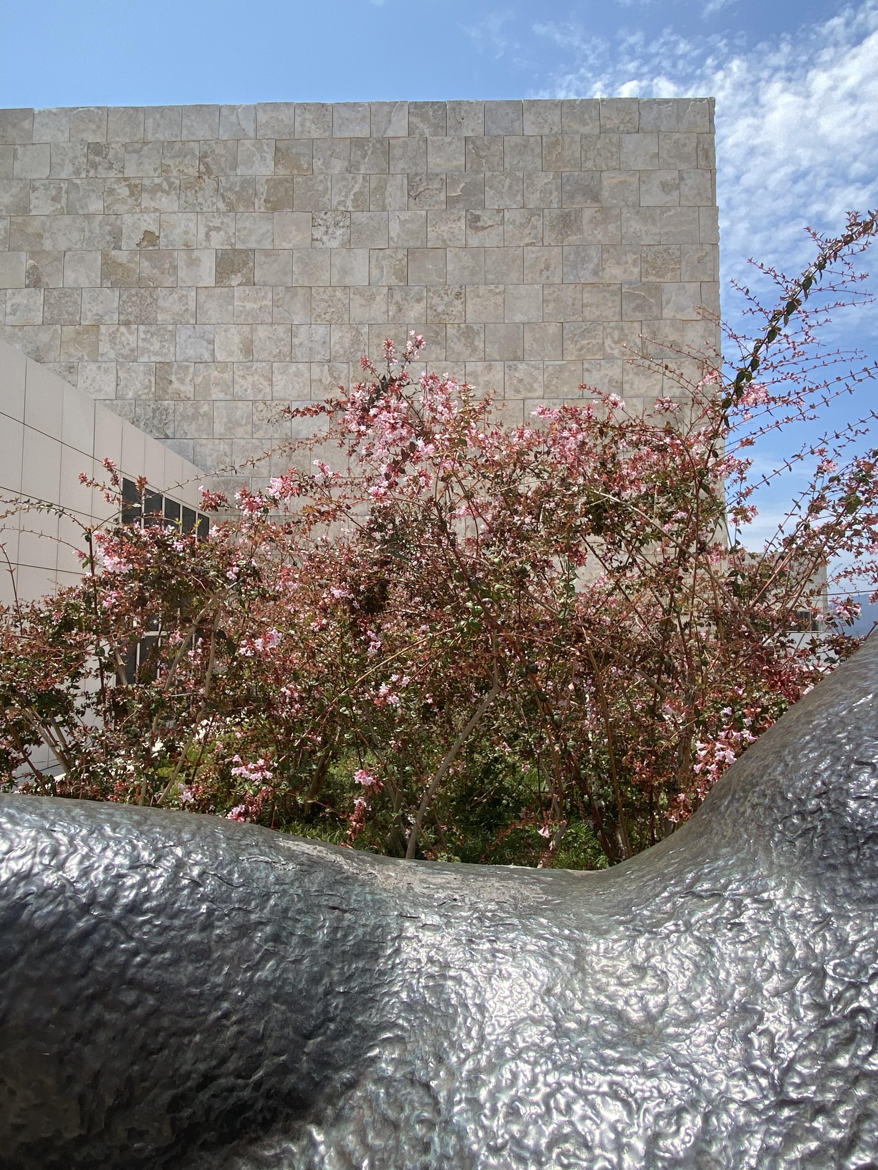
If I could go anywhere though, it’s Milan during Salone del Mobile. There is almost nothing I’d rather do than walk every single neighborhood, drink espresso, discover every single installation, sip spritz, and finally mangia a delicious dinner until 11:30 at night. And get up and do it again. The installations by the biggest brands in our industry at the Salone del Mobile are remarkable, elaborate installations. It seems no expense is spared in their construction. The last time I was there, in 2019, I noticed that the vignettes in each showroom had a kind of optimal viewing position. As people filed through, they all seemed to stop at the same spot and take a photo. Were we all taking the same photo? From the same point of view? Would we all post and publish and save to our “personal” memories essentially the same perspective? Even in the more organic pop-up installations outside the fairgrounds, around the city, the same was true.
I actually thought about this when we were creating our showroom design for NeoCon that year. Should we create an Instagram-able view? Is this good design—to have viewers drawn to a specific visual experience that we want them to have? Or is it forced, reducing the possibility of the experience to a singular, formulaic one?
Back to present, recently my brother surprised me with reservations at the Getty. I was completely overwhelmed. Before you even get inside there is a visual experience that is so voluptuous it is completely consuming. It’s striking how the experience is an absolute counterpoint to the one-point-of-view trend.
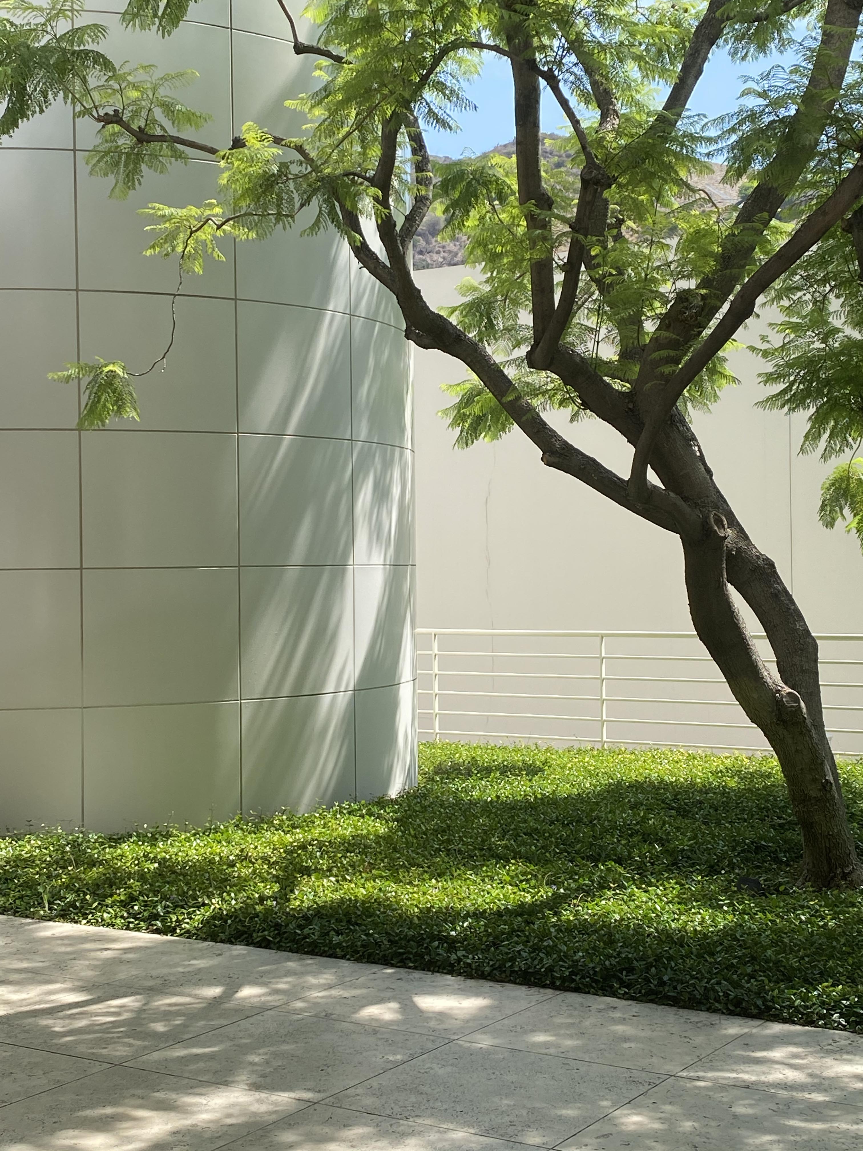
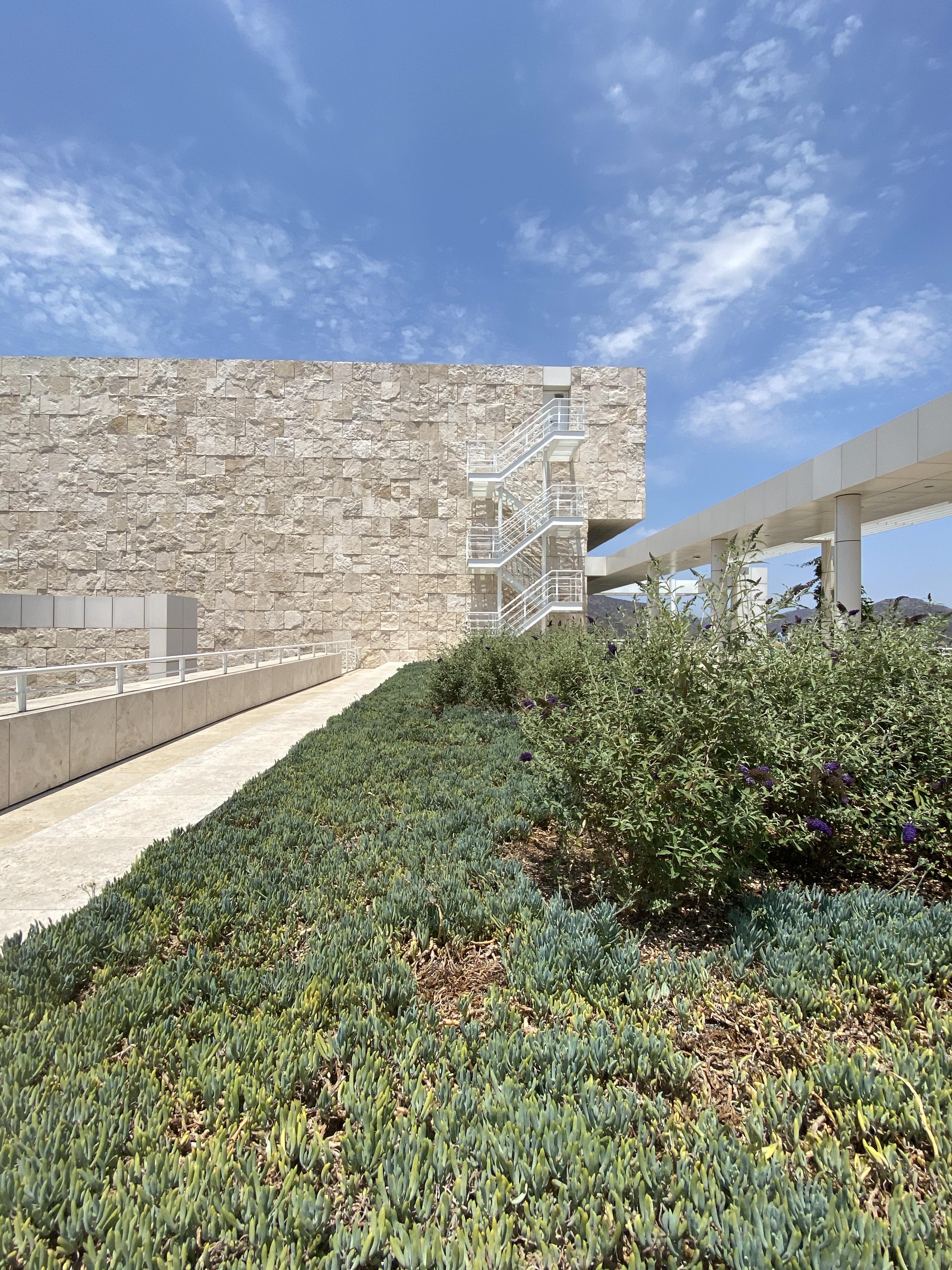
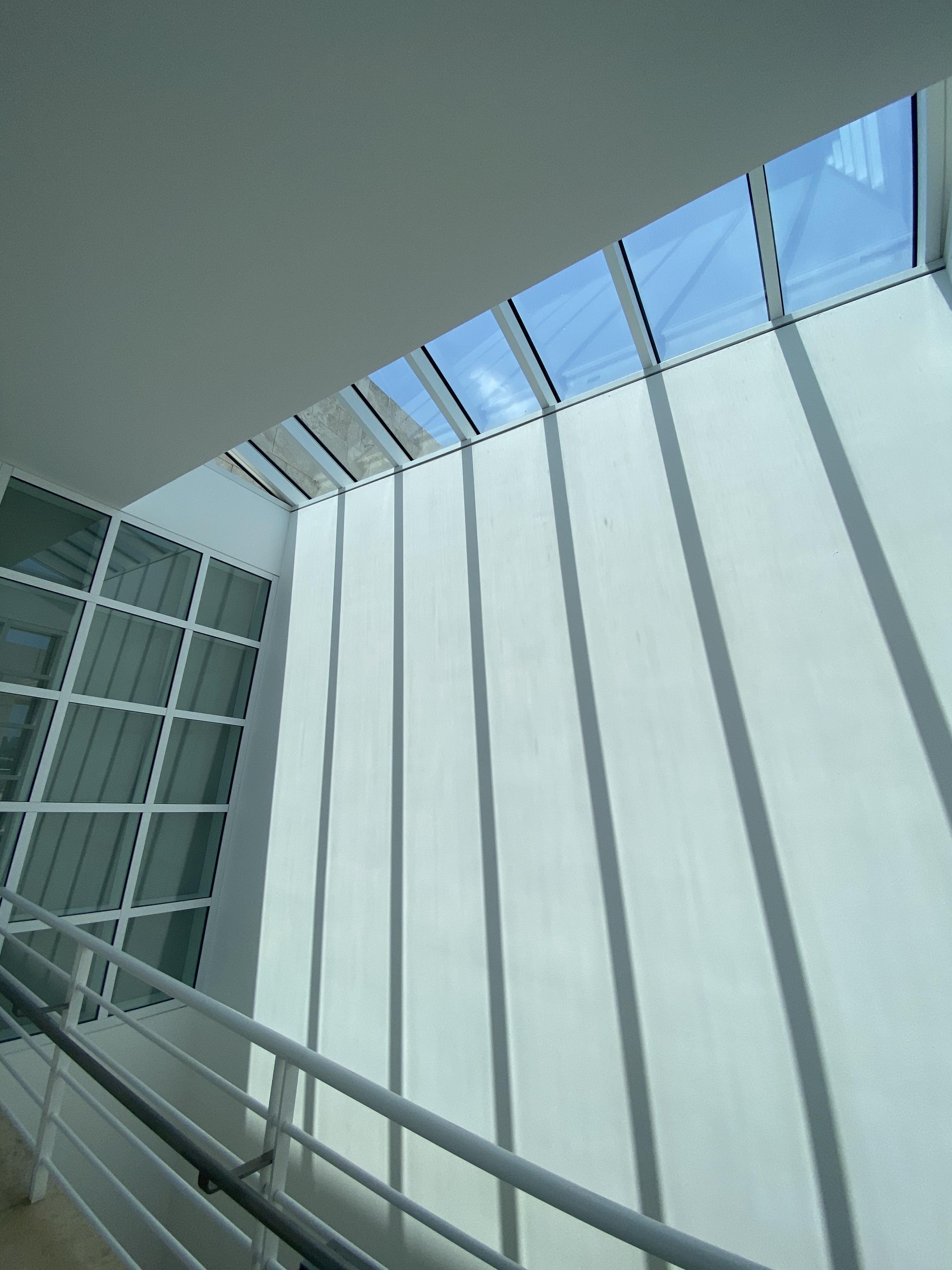
The Getty center was built long before the shoot-and-post approach to viewing. Designed by Richard Meier over 30 years ago with the stated goal of creating a harmonious blend of landscape and building, this campus presents a complex combination of light, geometry, and nature that literally thrills with ever view. Here you might pivot six inches in any direction to find an exquisitely framed view, layering water, sky, foliage, rough-cut stone, smooth aluminum and glass. Once inside, even the perfectly white painted walls are transformed by light and shadows from windows and skylights.
As we get closer to NeoCon this year (in person again!), all things design and art are spinning in my mind, making me think: perhaps creating a singular POV is the most efficient way to communicate in transitory installations like pop-up shops, event spaces and tradeshows, while complexity has a happy home in the permanence of a cultural fixture like a museum. Either way, I’m in! Here’s to our collective return to all the cultural experiences we’ve missed so much. Here’s to seeing things—together.
