Commercial Design’s New Beginnings in 2017: Color Palette Predictions

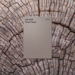
Tis the season for new year predictions. Right now, the design world is all abuzz about the color palettes expected to define 2017. Paint powerhouses Sherwin-Williams and Benjamin Moore recently named their colors of the year: Poised Taupe, a weathered neutral, and Shadow, a moody amethyst. But it’s the pick from the color forecasting authority Pantone that really has us talking.

Greenery, a fresh yet bold yellow-green hue, seems to be evoking a ‘love it or hate it’ reaction. Whether you’re a fan or foe, take some time to focus on what Greenery represents in our lives – personal and professional. After all, as we mentioned in a post earlier this year, color is much more powerful than most of us give it credit for.
Laurie Pressman, vice president of the Pantone Color Institute, says Greenery signifies a yearning to reinvent ourselves. “The Color of the Year is chosen to reflect what is taking place in the world… Greens help our heartbeat to slow down, help us to breathe and pull ourselves away from a world tied to flat screens and immerse ourselves in the physical beauty of the natural world.”
Agreed. In fact, Bentley’s vice president of design Todd van der Kruik predicted the rise of greens in 2016. In his annual commercial color trends article for Floor Focus, he said, “Green is… making its presence known, not only as an accent but also as a dialed-up neutral. It borrows from nature an ability to blend with its surroundings; its leafy tones range from sunny celadon to moss-like hues. Green remains neutral and in balance with nature.”

We predict 2017 will put a fresh spin on natural colors and textures in commercial interiors. As consumers become more conscious about wellness and more intentional about connection, we should expect to see more cleansing, organic tones that encourage connection, health, and wellness. Let’s get back to basics with more simplified, balancing hues. But don’t say goodbye to pops of bright colors, metallic bursts, or unexpected stripes and large-scale geometrics. We need those too! It’s all about longevity while still being forward-thinking, edgy, and fun.
What colors palettes do you think we should keep our eyes on in 2017?

0 Comments for “Commercial Design’s New Beginnings in 2017: Color Palette Predictions”