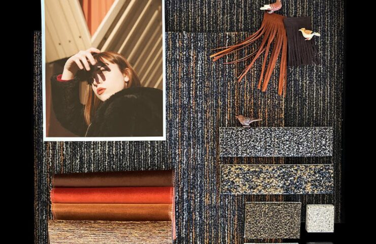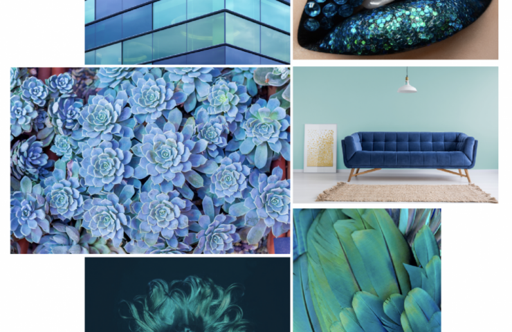
Sunset is not simply a daily occurrence, it’s also a state of mind. It’s calming moments that end the hours behind us, while at the same time preparing us for the new energy of the night. It’s the brightness and warmth of the sun expertly blended with the rich, darkness of the horizon. No matter where you are in the world, sunset is a magically and mysterious transition that envelopes the senses and sets the stage for the dawn of a new day.

From keeping us in order (red means “stop” and green means “go”) to conveying structure (think maps and color-coded lists) to expressing our moods – color is a powerful influence in our everyday lives. We live and breathe fashion, color and interiors, and we’re always looking ahead to what’s next. We provide designers with colorways that enable them to unleash their creativity, while still delivering a trendy – or timeless – aesthetic that their clients will adore.

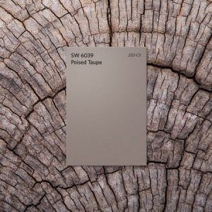
Tis the season for new year predictions. Right now, the design world is all abuzz about the color palettes expected to define 2017. Paint powerhouses Sherwin-Williams and Benjamin Moore recently named their colors of the year: Poised Taupe, a weathered neutral, and Shadow, a moody amethyst. But it’s the pick from the color forecasting authority Pantone that really has us talking.
